Halden: A Quiet Hotel
- Client
- Concept coastal hotel, Bergen, Norway (studio brief)
- Year
- 2026
- Role
- Brand & Identity
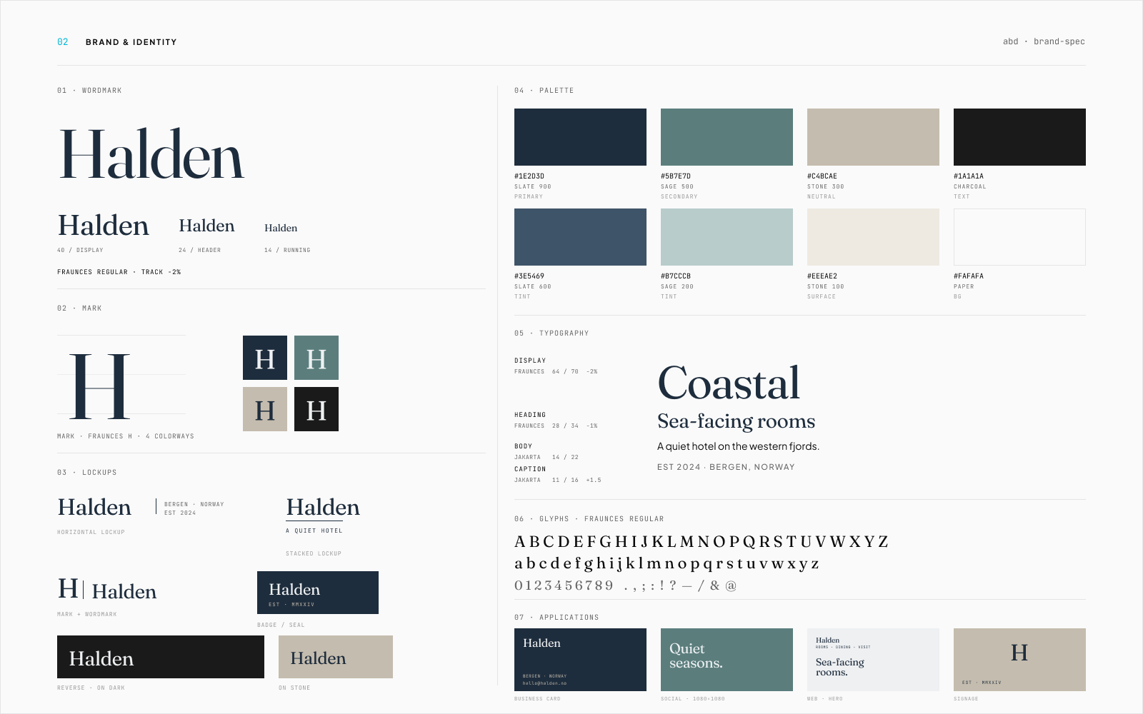
A brand system for a quiet coastal hotel on the Norwegian fjords, built to scale from a business card to a building seal without picking up volume.
Context
Quiet. Not luxury-loud, not wellness-template. The brief: a brand for a coastal hotel that reads quiet, where every mark and color works on paper, on stone, on a dark room key, and on signage at distance.
Approach
Wordmark set in Fraunces regular at -2% tracking, paired with a Fraunces H mark in four colorways. Six lockups so the brand resolves at any size and contrast: horizontal, stacked, mark and wordmark, reverse-on-dark, on-stone, and badge/seal. Eight-color palette anchored by slate 900 with sage and stone tints. Type system runs Fraunces 64/70 display down to Plus Jakarta 11/16 caption, with the caption pair (slate 900 on paper) held at 7.4:1 contrast and tested at 11pt as the floor. Applications validated across business card, social tile, web hero, and signage.
Designed to test
A brand system that holds its register from a business card to a building seal. Six lockups, an eight-color palette tested against paper, stone, and dark, and a type system that runs from a 64pt display down to an 11pt caption.
What good looks like
Good looks like: the mark stays legible at 8mm on a business card and at 8 meters on signage. Every lockup is tested against paper, stone, and dark backgrounds at AA contrast. The type system holds voice from a 64pt display down to an 11pt caption. Brand guidelines do not require a designer in the room for routine usage decisions.
Selected screens


Next project
Iris Calder, Tattoo Artist →
Or start one like this
See the packages