The Whittaker
- Client
- Boutique hotel (studio brief)
- Year
- 2026
- Role
- Brand, Web & Photo Direction
- Live
- hotel.alphabeta.design
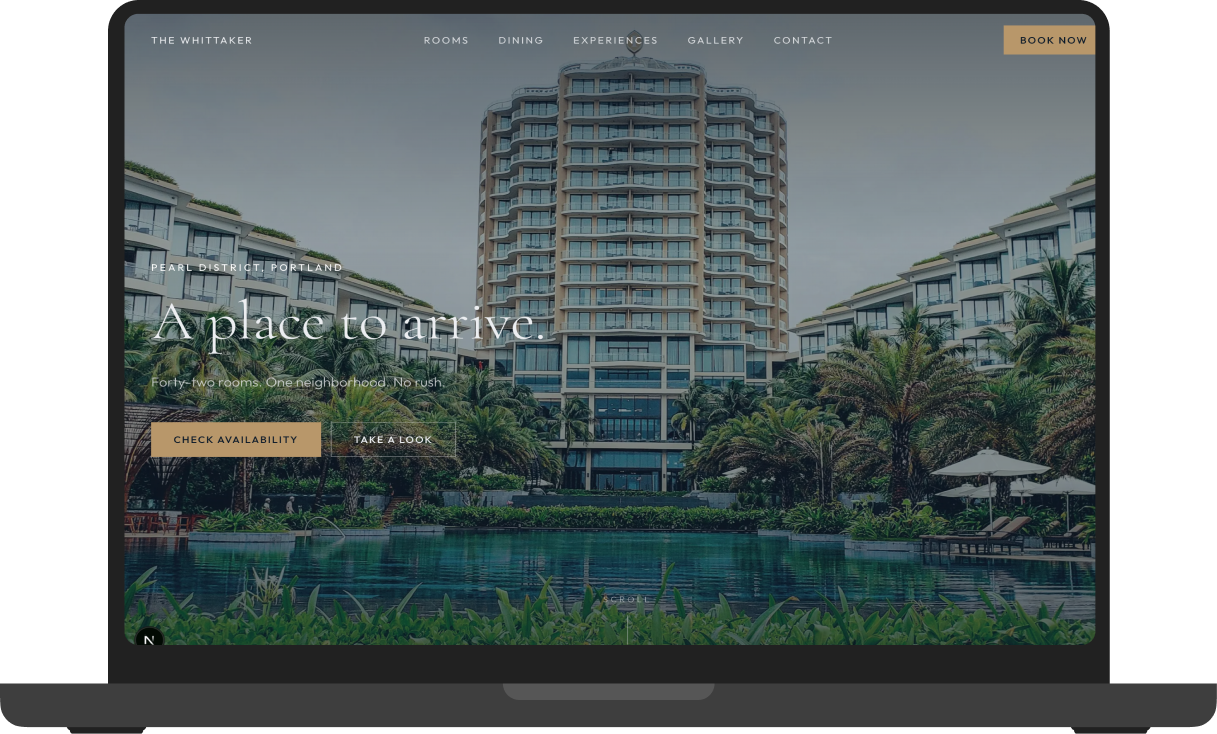
Growth, a marketing site for a 42-room boutique hotel in Portland's Pearl District. Twelve sections, six interactive components, editorial photography.
Context
A 42-room boutique hotel in a converted 1920s warehouse. Exposed steel, lobby gallery, real restaurant, rooftop bar. The property is the brand. The brief: design for it without letting chrome typography or franchise-template thinking get in the way.
Approach
Growth tier. Tabbed room gallery, masonry photo lightbox, press carousel, accordion amenities, embedded map, and a booking widget. Cormorant Garamond at light weight against Outfit sans for a quiet-luxury read. The photography does most of the work. A contrast pass on the type: Cormorant Light at small sizes is a known a11y risk, so the minimum tested size is 14pt against every backdrop it sits on, holding at 4.5:1 contrast or better. The masonry lightbox respects the OS reduced-motion preference, with a static grid as the fallback.
Designed to test
A 42-room boutique hotel marketing site where editorial photography carries the brand and quiet-luxury typography stays out of its way.
What good looks like
Good looks like: the photography carries the page weight, not the type or chrome. Booking-widget conversion holds rate against the franchise baseline. Cormorant Garamond Light is tested at 14pt minimum with at least 4.5:1 contrast against every backdrop it sits on. The masonry lightbox respects reduced-motion.
Live site
hotel.alphabeta.designSelected screens


Next project
Men's Sole Revival →
Or start one like this
See the packages