ABD UI: Production Design System
- Client
- Internal, Alpha Beta Design
- Year
- 2026
- Role
- Design System Lead
The production design system behind every ABD client build. 120 components, 15 color tokens, four output formats. Built so the studio doesn't restart on every project.
Context
One person, every ABD project. Launchpad sites in two weeks, Growth flagships in a month, brand systems in between. The button has to get designed once. The constraint set: one token source of truth, one component contract, one accessibility floor. Production-grade or it does not count.
Approach
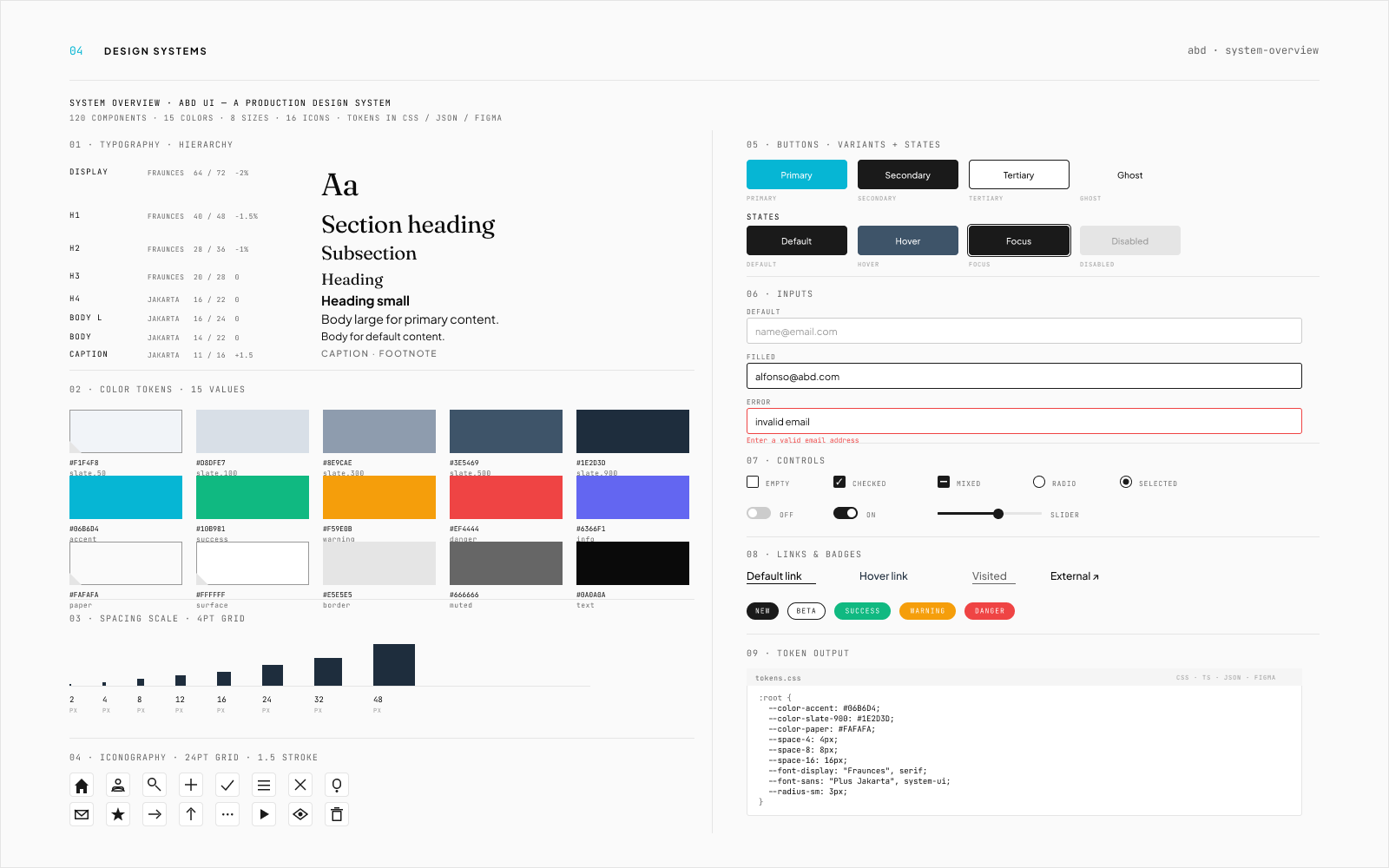
Design tokens authored once and exported to CSS variables, TypeScript types, JSON, and a Figma library. Components scoped to a variants-by-states matrix (Primary/Secondary/Tertiary/Ghost × Default/Hover/Focus/Disabled), not per-screen one-offs. Inputs documented through their failure states. Controls cover checkbox, mixed, radio, switch, and slider so forms compose without fresh decisions. Iconography on a 24pt grid at 1.5 stroke. Type system runs Fraunces display against Plus Jakarta body. One decision worth naming: tokens are role-based at the surface (surface, border, muted, text, accent) and literal at the palette (slate 50 through 900). A pure literal scheme was tested first and dropped because dark-mode parity required renaming every component reference. Role-based tokens make a theme swap a one-file change instead.
Outcome
The system that compiles every ABD client site in this portfolio. Token output in four formats, a variants-by-states component matrix, and an accessibility floor (focus rings, contrast, motion) that isn't re-litigated per project.
What good looks like
Good looks like: every new component lands in the library within an hour of design lock. Token changes propagate to four output formats in one PR. The accessibility floor (4.5:1 contrast, focus rings, reduced-motion) is verified by automated check, not by designer memory. Three concurrent client projects build on the same library without forking it.
Selected screens


Next project
Stride: Daily Workout →
Or start one like this
See the packages